凭借前所未有的空间力量成为银座的新起点 An Unprecedented Space That Marks a New Starting Point for Ginza
INTERIOR
Gwenael Nicolas
考虑商场的三大重点
我认为这次的商场在规划上有三大重点。其一是必须为空间塑造象征性元素。例如,当前时代不只是是否上镜的问题,成为媒体宠儿也很重要。人们到这里拍照时,必须有能够一眼看出“这里就是GINZA SIX”的景点,以巴黎街道来说,就像是埃菲尔铁塔那样的存在。GINZA SIX则是以二楼的挑高中庭为象征。
其二是设定好各种场景进行模拟,从而设计出人在空间中的动向。例如,从某个地点到另一个地点需要花几分钟?此时是否需要再多设一台电梯?希望这一带有光线,是否需要挑高?……。空间的能量自然循环,这样的空间不会对人们的情绪和身体感受造成负面影响。其中有些部分必须与建筑师合作。
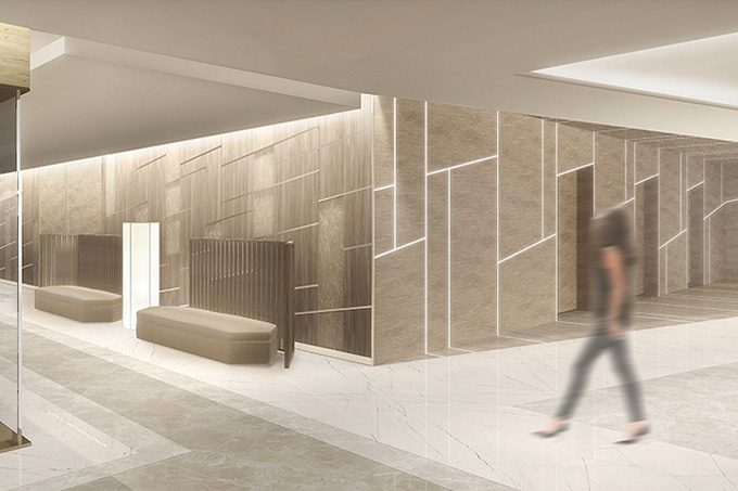
最后第三点是设置动态的空间与能够放松的空间,让整体空间张弛有度。在商场购物的速度因人而异。在GINZA SIX中,设计了像蚕茧一样的原创沙发,作为稍作休息的场所,背后摆放着木质屏风,营造出舒适的空间。
另一方面,为避免规模巨大的楼层过于单调,因此以保存至今的银座街道为原型,将商店前的通道设计成蜿蜒状。因为这种蜿蜒的设计,所有店铺都形成拐角,不会像普通商场那样,一眼就能看到整条街道,如同走在小街小巷中,享受邂逅每家店铺的喜悦之情。
The Three Essential Elements of a Shopping Mall
When it comes to designing a shopping mall like GINZA SIX, I believe there are three essential elements. One is the need for an iconic element within the space. Namely, in this day and age, it is important to be not only photogenic, but media-genic as well. Much like when people visit Paris they take the obligatory Eiffel Tower photo, you need something instantly recognizable as GINZA SIX that guests will naturally be inclined to snap a picture of. At GINZA SIX, we've positioned the large four-story atrium on the second level as our central picture-worthy attraction.
Second is to design the flow of people through the space using storyboards to simulate various scenarios. How many minutes does it take to get from point A to point B? Wouldn't it be easier if there were another elevator there? I'm thinking people will want to encounter some sunlight right around here—how about we make this an atrium?...It's absolutely key that the energy of the space flows naturally, and that no physical or emotional stress is placed on the guests. This part involves working together with the architect.
The third element is to provide variation: dynamic shopping experiences as well as areas of calm to sit down and relax. It's important to remember that everybody browses and shops at a different pace. For GINZA SIX, we've created an intimate premium lounge where guests can catch their breath, complete with custom-designed sofas that are so comfortable it's as if you were being wrapped in a cocoon, and a backdrop of wooden byobu [decorative multi-panel folding screens that serve as room partitions].
Also, in order to impart a sense of wonder on guests as they walk through the spectacular retail levels, we've set up the walkways in a zigzag orientation, evoking Ginza's narrow side streets and back alleys that remain to this day. The zigzags give each store a corner that faces out into the walkway—which means that unlike your standard inline shopping mall where you have a straight line of sight from one end to the other, guests naturally come face to face with each store as they walk around, and this creates a feeling of excitement about what could be around the next corner.

最重要的是空间为了谁而存在
GINZA SIX是吸引全球人士的国际性商场,但是我希望将日本的精华融入室内装潢中。虽然重视外来游客很重要,但我却认为应该创造一个能让居住在日本的我们或自己家人首先感觉开心的空间,我觉得不可偏离这点。
例如,日本的建筑使用了拉门和灯笼,设法让柔和的光线照射到各个角落,而GINZA SIX则在挑高的中庭订做了三维和纸,让来自天窗的自然光柔和穿过,使光线遍布各处。楼梯扶手上采用了百叶窗结构,再搭配上形似竹子的格子。
凝聚空间的工匠精神该如何呈现也是我费心的部分。我尽可能使用手工材料,部分电梯厅的墙壁使用有纹理的亮漆妆点铝的表面。商店林立的通道墙壁则在各关键地点使用工匠制作的和纸。通过材料的层次和品质来呈现空间,这种方法不只运用在GINZA SIX,也是我所有项目共同的设计重点。可以这么说,日本的设计是建立在层次和品质之上的。拥有巨大规模的GINZA SIX为避免带给人一种空旷工厂的印象,我特别在意它的协调感。
GINZA SIX所提出的“New Luxury”也不是用一点来表达“这真厉害啊”,只是通过整体感受到的东西吧。除了室内装潢外,还有建筑设计、平面设计、艺术作品、能乐堂等的文化,都要能够让人感受到大自然,让人感觉宾至如归。反过来说,无论是高级旅馆,还是商务旅馆,可能没有太大差别,只要整体协调,我觉得就可以认为“全部都很出色”。
Who Should the Space Be For?
I believe that GINZA SIX will become an international shopping mall that will attract guests from around the world. But in spite of that—or maybe even because of that—I wanted to imbue the interior design with the essence of Japan. While it is important to keep in mind that many of our prospective patrons will be from outside of Japan, my first priority was to design a space that our team of designers, our families, and those of us who live here in Japan would enjoy coming to. It was critical not to lose sight of that.
For example, in Japanese architecture, you use fixtures like shoji [sliding screens made of translucent paper over a wooden frame] and lanterns to diffuse light throughout a space. At GINZA SIX, I had 3D washi [a Japanese style of paper commonly made using fibers from the bark of mulberry trees, paperbush, and Gampi trees] incorporated into the ceiling of the atrium in order to diffuse the natural light coming through the skylight and bathe the retail levels in gentle light. And for the staircases we've installed louver railings with latticework designed to resemble bamboo.
I was also very particular about how attention to detail and touches of craftsmanship are used to bring the space together. Wherever possible, I integrated handmade and handcrafted elements. A number of the elevator hallways, for example, have walls covered in aluminum with a lacquer finish. And along the walls of the main walkways, you'll come across creative use of washi made by an expert papermaker. Using layers of design and the unique qualities of individual materials to bring a space to life—this has always been a central characteristic of my work, and GINZA SIX is no exception. And you can say that the use of layers and qualities are the foundation of Japanese design as well. So with a space as grand as GINZA SIX, it was important to achieve a balance between the two, so that it didn't end up feeling like some large industrial factory.
GINZA SIX's vision of "New Luxury" is not something that draws attention to itself, not something you can pinpoint; rather, it's an aesthetic that permeates the entire undertaking from top to bottom. It applies not only to the interior design, but the architecture, graphic design, and artwork on display, as well as the Noh theater and other cultural attractions, greenery, and, of course, the service and hospitality. To put it another way, New Luxury is not about what or how much you do with a space, but whether or not what you do is right for the space. In that sense, whether you were to choose to spend the night at a high-end ryokan [traditional Japanese inn] or a business hotel, one experience is not necessarily more "luxurious" than the other, because it's a question of overall balance and the thought put into it. Again, not what or how much you can do for your guests, but whether or not what you do is right for your guests.


商场所需的最后层次
我个人觉得银座的后巷出奇地有趣。不但有很多美味餐厅,还有艺术品和工艺品商店,小小建筑中汇集了各种经营形态的商店,如果只走在国外观光客蜂拥而至的主要街道上,根本无法发现这种浓厚的文化依然保留着。银座在拥有国际化一面的同时,也是富有日本精髓的地方。而GINZA SIX有240家商店进驻,充分体现出银座后巷这种“商店云集的乐趣”。
巴黎有全球最古老的百货公司“Bon Marché”。我十分喜欢,去巴黎时经常去那里购物,其人性化的规模、零售设计都非常优秀,而且擅于选择,更重要的是位于高级住宅区,所以“针对左岸富裕阶级”的定位鲜明。于是造就了附近居民常来光临,观光客也因此前来的循环。
换句话说,商场最后所需的层次是“人”,我认为绝不能忘了这部分的品质。GINZA SIX或许同样需要循序渐进的讯息和逻辑,首先是针对生活在周边的人们和在此工作的人们,其次是针对来银座用餐的顾客群,然后从东京推广到日本,再从日本到海外,依序受到这些地方人们的喜爱。
各位到银座时,认为哪里是中心呢? 目前可能是银座四丁目的十字路口。但是我想改变这种情况,让人们到银座时“首先在GINZA SIX会合”。
GINZA SIX拥有过去商场所沒有的室内装潢,希望GINZA SIX能受到各位的喜爱,成为银座的新起点。
The Layer That Completes a Shopping Mall
Personally, I find Ginza's side streets and back alleys to be among its most intriguing features. They're lined with great places to eat, arts-and-crafts stores, and small buildings occupied by seemingly every type of business, and are where you'll find a deep-rooted culture that you would never encounter if you kept only to the main tourist thoroughfares. These streets are cosmopolitan, but at the same time they are infused with the essence of Japan. GINZA SIX will be home to 240 stores, but I designed the interiors to bring out that same Ginza side street feel of wandering into a delightful hodgepodge of establishments.
Incidentally, did you know that the world's oldest department store is Le Bon Marchéin Paris? I'm such a big fan that I make several shopping trips each time I visit Paris. They're masters of retail design—the place is built to human scale, and their product selections are excellent—but most of all its location in an upscale residential area means that it caters to a clear demographic: the affluent class of the Left Bank. As a result, the place is always bustling with local residents, which in turn attracts tourists, and one feeds into the other.
In other words, the final layer that is absolutely necessary for a shopping mall is people—and not just anybody, but people of a particular poise and quality. With GINZA SIX, first and foremost we wanted to create a destination that captures the hearts of the people who live and work in the area. Then from there, we will expand that circle to the people that come to Ginza to have lunch or dinner, to all of Tokyo and then Japan, and last but not least, abroad. You need a message that is not one-size-fits-all, but adaptable and universal. It's a gradual process that has to be thought out and executed carefully.
When you visit Ginza, where do you think of as the center? Many point to the Ginza 4-chome intersection. My goal is that in the not too distant future people will be saying to each other "Let's meet up at GINZA SIX."
GINZA SIX is a shopping mall with an interior the likes of which has never been seen before. I hope that it captures your hearts and imaginations, and becomes a new starting point for Ginza.

Gwenael Nicolas
1966年出生于法国。在巴黎、伦敦学习设计,1998年在东京成立设计工作室“CURIOSITY”。近年来参与诸多全球性精品品牌的商店设计工作。
Gwenael Nicolas
Born in France in 1966, Gwenael Nicolas studied design in Paris and London, and established design studio CURIOSITY in Tokyo in 1998. He is known for designing the interiors of many luxury brand stores in Japan and around the world.
(2016年9月采访)
Interview and Text by Yuka Okada / Photographs by Satoko Imazu


