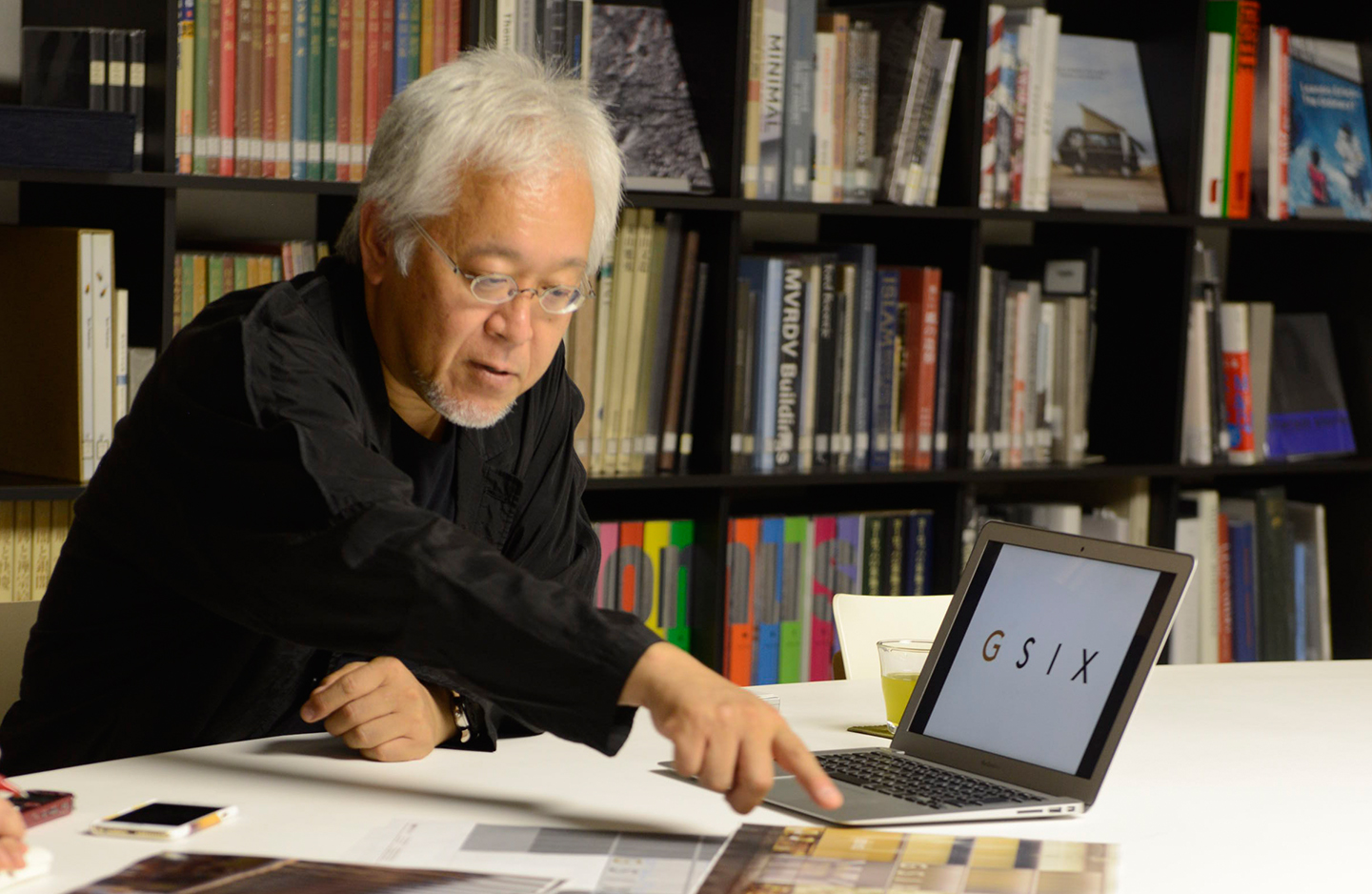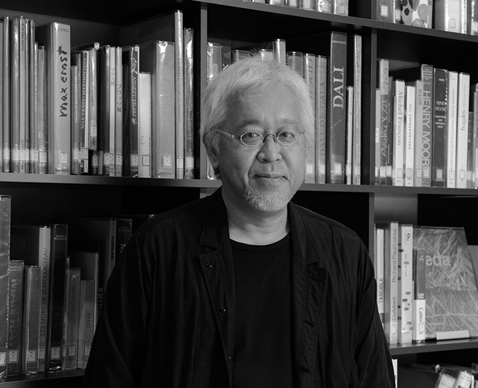
GSIX的商标蕴含了银座具有的轴性 Imbuing the “GSIX” Logotype with Ginza’s Poise
VISUAL IDENTITY
原研哉
何谓适合银座的商标
我认为银座具有扎实的“轴”。例如,同为东京的闹区,六本木的特色在于不稳定,或许可以说,正因为六本木聚集了不稳定的元素,反而成了它的魅力所在。新宿则是精力充沛的极致混沌。所以听到银座盖了GINZA SIX这巨大的商业设施,而且还有许多高级品牌进驻时,我就认为以商标为核心的VI(视觉识别)必须有足以支撑所有事物、相当强韧的“轴性”。
另一方面,谷口吉生先生的建筑设计并不是塞满了让人啧啧称奇的华丽高科技或外观设计,而是极静极简。想要贴近这样的建筑设计,我觉得如果商标华奢或是细部繁复,将会削弱建筑本身的力量。如果不能用相同的世界观串连在一起,简洁的元素就没有意义了。
于是这次完成的商标也简单到让人不禁想问“这么简单行吗?简洁,不仅仅是豪华和时尚,传统文化、高科技、现代艺术…我觉得这是可以贴近所有场景的东西。
顺带一提,我虽然把主商标设计成“GSIX”,但是原本的课题是“希望能用GINZA SIX来设计”。只不过我从1983年任职于日本设计中心后,已经有长达33年的时间在银座工作,无论是大楼或是商店,老是加上银座这两个字,感觉有点腻了……(笑)。于是我建议使用“GSIX”的缩写设计。
颜色方面,只有“G”采用金色。对我来说,银座的形象色彩是金色。虽然我也想说银座应该是银色,但是对于方才提到的“轴性”,我认为金色是最适合的颜色。
A Logotype Fit for Ginza
If you ask me, Ginza is a shopping district that has poise. Look at other bustling areas here in Tokyo: Roppongi can be indecisive and even insecure, and you could even say that its very charm lies in it being a hodgepodge of ambivalent ideas. Then there's Shinjuku, which is brimming with energy and is the epitome of chaos—in a good way. So when word came to me that a large shopping mall called GINZA SIX was being built with many high-end brands among its tenants, I knew that the logotype and the entire visual identity around it had to have the kind of solid backbone that can stand the test of time.
At the same time you have Yoshio Taniguchi, whose architecture is not the kind that wows you with showy technology or excessive design—rather, it is extremely static and minimal. When you think about how closely the logo will be associated with the building itself, and vice-versa, a logo that disregards the overall aesthetic and is too refined or too festive may unintentionally subvert the power of the architecture. If the architecture and the visual identity were both going for simplicity, it had to be within a unified aesthetic—otherwise, there would be a disconnect.
Consequently, the final logo for GINZA SIX ended up being surprisingly simple. But it's that simplicity that gives it almost universal applicability, whether it's luxury, fashion, traditional culture, cutting-edge technology, contemporary art...you name it.
Incidentally, the main logo is comprised of the letters "GSIX", but initially I was asked to use the full name "GINZA SIX". But as someone who has been working in Ginza for 33 years since I first joined the Nippon Design Center in 1983, I had seen so many buildings and shops with "Ginza" in the name that it had become cliché…(laughs). So I proposed an abbreviated form: "GSIX".
As for the color, only the "G" is gold. In my mind, if Ginza was a color, it would be gold. You were probably expecting me to say "silver" [Ginza means "silver mint"], but for me, gold captures its poise.

装饰于正面的标志与建筑物的关系
说到规划建筑物正面的标志,一般人通常认为是建筑物完成之后才加上去的。此外,很多商标在文字的背后打光,突显商标,而GINZA SIX则是将“GSIX”的标志埋入、嵌进建筑物里。到了晚上,文字会有从建筑物内部白色浮现而出的的感觉。这个部分如果不和建筑物一体规划就无法成立。因此,在楼群的正面所面向的银座街道的环境中,我期待“GSIX”看起来会更精致、或者是全然不同的质感与印象。
另外,和位在GINZA SIX 1楼的高级品牌的商标并列在一起,“GSIX”的商标也必须昂然挺立而毫不逊色,同时还必须支撑着这些品牌。能够在这个时候发挥的,我认为终究还是来自于商标简洁的“轴性”。
银座大街上的大楼,据说大多在1964年东京奥运会的时候完成。想必银座也将以2020年的东京奥运会为契机,再次重生吧。届时,无论哪一位建筑师或设计师,应该都会思考该如何表现未来的风格,而非刻版印象中的日本,换言之即非直接沿用江戸式的家徽或装饰绳结的造型。无论以前或现在,银座都是通过日本而意识到新生长点的一个地方。
从这层意义来看,GINZA SIX的商标也是一种“和”的日本精神,我一边思考着如何迎接、接待外来的人们,一边创作设计。
The Relationship Between Facade and Sign
Plans for the sign on the facade usually come after the building has been completed; often the logo is simply attached to the front of the building and backlit to give it a three-dimensional appearance. But with GINZA SIX, the GSIX s"ign is embedded in the architecture and illuminated at night from within the building—giving it a distinctive white glow. For this to happen, the building letters had to be designed together with the architecture. So I'm confident that this facade will be able to hold its own along the stretch of facades on Ginza main street [Ginza's main shopping thoroughfare, Chuo-dori]. My hope is that it leaves a singular, lasting impression on customers and passersby alike.
And of course, the GSIX logo has to be able to stand above the logos of the high-end brands that will occupy the ground floor of GINZA SIX. But at the same time it has to be able to give them the space to shine. That's where, I think, the logo's solid backbone will do the heavy lifting.
Someone once told me that the majority of the buildings on Ginza main street were built to coincide with the 1964 Tokyo Olympics. Perhaps the 2020 Tokyo Olympics will be an opportunity for Ginza to undergo a renaissance. In the coming years I am sure all of the architects and designers involved in local projects will be inspired to design the Tokyo of tomorrow, rather than rehash stereotypical Japanese designs, such as Edo Period family crests and mizuhiki knots [a traditional decoration made from a cord of tightly wound and starched rice paper, often used to adorn gifts and cards]. Ginza has long been and will continue to be a growth point through which Japan strives to reach new heights.
In that sense the GINZA SIX logo embodies wa [a cultural concept roughly translated as "harmony" or "peace", in addition to being an ancient name for Japan itself], and throughout the development process I was constantly asking myself how it would welcome and receive our guests.

期待GINZA SIX扮演的角色
日本式呈现“价値”的方式里,存在着独特的方法。向国外人士说明时,我使用了“Empty(空)”这个字。不是以多制胜,而是尽可能什么都不展现,反过来通过接受对方的想象发挥而创造出价値的方法。
虽然也有像豪华绚烂的托普卡普宫殿那样,用宝石分散的表现来唤起人们注意的手法,但并不是将信息填入,而是“空荡”。于是不知不觉中,人们就以自己的想象补满了空。利用这种方法产生的,或许就是日本这个国家独特呈现的豪华吧。
例如,壁龛就是利用一朵鲜花或是一幅字画来表现些什么。如果能善加运用“鉴赏的方式取决于自己”等感觉,日本不就显得有趣了吗。
具体表现这种日本式的奢华,让对方渴望。该如何呈现这一理念,让顾客一边领会我们拥有的文化背景,一边想专程到日本来消费。
或许和以往高级品牌呈现的豪华不同。但是,如果能体现出这些事情的话,我想和GINZA SIX所提出的“New Luxury”也有关联吧。
如果银座的正中央能有持续产生此种价値的心臓就好了。我期待GINZA SIX能扮演这个角色。
High Hopes for GINZA SIX
In Japan we have a unique way of expressing aesthetic value. When I try to explain this concept to foreigners, I use the word "emptiness". Instead of overwhelming the observer with ideas, you make every effort to impose nothing. It's about leaving room to receive the observer's worldview, interpretation, emotions, ideas, etc.
The gorgeous and ostentatious TopkapıPalace in Turkey puts all of its jewels on display, and that is one way to attract interest—and certainly, one type of beauty. But what if instead of packing a space with every idea you've got, you left it as "empty" as possible? People would have the freedom to conjure up their own ideas and impressions—and the space would be all the richer for it. For me, that is the way to invoke a new vision of luxury that this country alone can put forth.
It's essentially the concept behind the tokonoma [an alcove in a Japanese-style reception room for displaying a flower arrangement or other piece of art]. The space exists to inspire you—maybe to display a single-flower arrangement, or to hang a picture scroll. Japanese culture can often come across as impenetrable, but if we can convey a sense of "this is open to interpretation", I think people would be much more interested in seeing what Japan has to offer.
So we should give foreign visitors a taste of Japanese-style luxury as a way of speaking to their inner desires. We should possess a true understanding and appreciation of our own cultural background and focus on how to present a vision that will inspire people to come all the way to Japan to experience it firsthand—to buy and take home. And that may be different from the conventional image of luxury put forth by high-end brands up until now. But I believe it is the path to realizing the New Luxury envisioned by GINZA SIX.
My wish is for GINZA SIX to become the heart and soul at Ginza's center, a wellspring of new ideas, beauty, and value.

原研哉
1958年出生于日本冈山。日本设计中心代表取缔役社长、武藏野美术大学教授。制作长野奥运开幕及闭幕式节目、爱知世界博览会官方海报等,从事诸多深耕日本文化的工作,和“物”的设计一样重视“事”的设计。在GINZA SIX亦参与TSUTAYA的VI设计。
Kenya Hara
Born in Okayama Prefecture in 1958, Kenya Hara is President of Nippon Design Center and a professor at Tokyo's Musashino Art University. Much of his work is deeply rooted in Japanese culture, including the programs for the Opening and Closing Ceremonies of the Nagano Winter Olympic Games (1998) and the official poster for Expo 2005 held in Nagoya in Aichi Prefecture. He is a renowned designer of things as well as experiences. In addition to GINZA SIX’s overall visual identity, he has developed the visual identity for its TSUTAYA store.
(2016年9月采访)
Interview and Text by Yuka Okada / Photographs by Satoko Imazu


