
中央大道上高挂“暖帘”的六大品牌的挑战 Six Brands Put Up "Noren" Along Ginza Main Street
NOREN
CÉLINE, DIOR, FENDI, SAINT LAURENT, VALENTINO, VAN CLEEF & ARPELS
共同呈现GINZA SIX规格的商店设计
GINZA SIX有超过100家的旗舰店,包括日本国内及银座首家店铺及新经营型态等在内,集结了大约240家之多的全球品牌。其中沿着中央大道的正面入口,有DIOR、VALENTINO、CÉLINE、FENDI、SAINT LAURENT、VAN CLEEF & ARPELS六大品牌,以负责GINZA SIX建筑设计的谷口吉生所提案的“暖帘”,设置在自家的门面。
店铺遍布于全球的精品品牌,对于建筑及空间设计,乃至于使用于其中的昂贵素材、原创家具等,各有其不可动摇的商店概念。但是,每一家开业的店铺,均需面对散发现代豪华感的新挑战、以及汲取场所的特色后,方得以呈现的完成感。就这层意义而言,GINZA SIX能与银座这个场所性匹敌而值得一看的,首先就是“暖帘”的设计,还有就是穿过正面之后的店内空间挑战。
GINZA SIX Exclusive Retail Designs Share Center Stage
When its doors open, GINZA SIX will be home to about 240 brands from around the world, including over 100 flagships, brands coming to Japan or Ginza for the first time, and new retail concepts making their Japan debut. Six of these brands will have entrances and unique facades along Ginza's main shopping thoroughfare, Chuo-dori: DIOR, VALENTINO, CÉLINE, FENDI, SAINT LAURENT, and VAN CLEEF & ARPELS. The idea for brand-specific facades originated from GINZA SIX's architect Yoshio Taniguchi, who looked to the tradition of Japanese stores hanging up noren, entrance curtains decorated with low-key motifs (usually the store's logo or crest).
Luxury brands have a worldwide presence, and each of their retail locations have a clearly defined store concept that is reflected in everything from the architecture and the interior space to the extravagant materials used therein, and even down to the original furniture. But there are more pieces to the puzzle: each new store must have something bold and new to say about contemporary luxury, and embrace a sense of place and local identity in their approach. In that sense, the noren-inspired designs of the facades at GINZA SIX are a tribute to the noren-lined historical townscape of Ginza—and what lies behind them is sure to delight and impress.
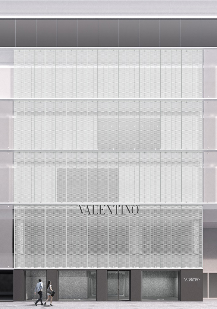
Valentino - Ginza
designed by David Chipefield
首先是DIOR(地下1楼、地上4楼),DIOR的外观亦是由负责GINZA SIX建筑设计的谷口吉生负责。彷佛唤起衣裳綷縩的独特设计,呈现在眼前。店内由以美国为据点,参与DIOR全世界店铺在内等诸多品牌建筑空间设计的Peter Marino,塑造出融合当代氛围与摩登家具为一体的空间。此外,1楼通道上设有4个大窗,移步往前,随即出现高7米的挑高中庭。室内装潢的色彩强调白色调,位在上方楼层的鞋子区墙壁,设置了备受巴黎现代艺术瞩目,来自于瑞典的Tarick Kiswanson的艺术品等,营造画廊的元素。
另外,VALENTINO(地下1楼、地上4楼)由足以代表英国的世界级建筑师David Chipperfield ,以及品牌创意总监Pierpaolo Piccioli携手合作,提出创新性的商店概念。整个正面使用了金属丝网,柔和了白天来自于中央大道窗户的阳光,晚上将店内的灯光投射在街道上,塑造出反差,同时兼顾顾客的隐私。入口大门使用了极简的黑金属素材,和金属丝网一样,均是为了融合谷口的建筑设计。另一方面,店内则以“宫殿”为主题,为了塑造其独特的氛围,不只采用了新品,也搭配了古老的装饰,实现了与以往的设计有所不同的空间。虽然集结了具体呈现品牌的元素,但并非单纯的怀旧,而是挑战打造出过去遗产与未来新创意共存的空间。
For DIOR(B1-4F), the architect Yoshio Taniguchi conceived a unique facade evoking a tonal interaction of a dress, structured by four large windows at street level. Inside, Peter Marino, the U.S.-based architect of DIOR boutiques around the world as well as other brands, has created a contemporary atmosphere dominated by white tones, in which modern furniture integrates seamlessly. As the visitors enter, they are greeted by the House's seven-meter high atrium. Adding to the gallery-like feel, the walls in the shoes section on the second floor are decorated with the artwork of Swedish-born Tarick Kiswanson, who is currently being hailed as the next big thing in Paris's contemporary art scene.
Next is VALENTINO (B1-4F), where creative director Pierpaolo Piccioli has teamed up with world-famous British architect David Chipperfield to boldly put forth an innovative store concept. The facade is made up of metal mesh from top to bottom, creating a contrast between the gentle rays of sunlight that enter through the windows facing Chuo-dori during the day, and the glow from inside the store that illuminates the street at night—while maintaining a private shopping experience all throughout. The minimal design of the black metal front doors complements the metal mesh, both of which are beautifully in tune with Taniguchi's architecture. Inside is a palazzo-themed retail space furnished and decorated with things both new and old to create a one-of-a-kind atmosphere, an intriguing alternative to the brand's traditional space design. All of the brand's iconic elements have been gathered here, but much more than a collection of nostalgia, this is a space that demonstrates that there is plenty of room for heritage to coexist with forward-thinking ideas.
此外,CÉLINE(地上2楼)对于“暖帘代表正面”的提案,根据“地方性”与“时间”的关键词,用日本土制成的陶板造型表现正面。继承长久传统的职人,以手工技术制成的陶板,一片片均释放独一无二的素材感,店内的细部装潢主要亦使用了土石之类呈现温暖感的天然素材。陶板的格局也考虑到白天光线由外往内、晚上光线由内往外的不同风情。采用有别于装饰手法的纤细表现,塑造出独具个性的世界观。而FENDI(地下1楼、地上3楼)的正面设计则是以罗马的历史建筑物、品牌根据地“意大利文明宫”为灵感。通过品牌的视角所看到的罗马,将之投射在GINZA SIX,同时以几何学而又高雅的连续拱门,与日本传统式的“暖帘”产生情感上的连结等呈现手法,无论哪一个品牌均具有强调日本元素的特征。
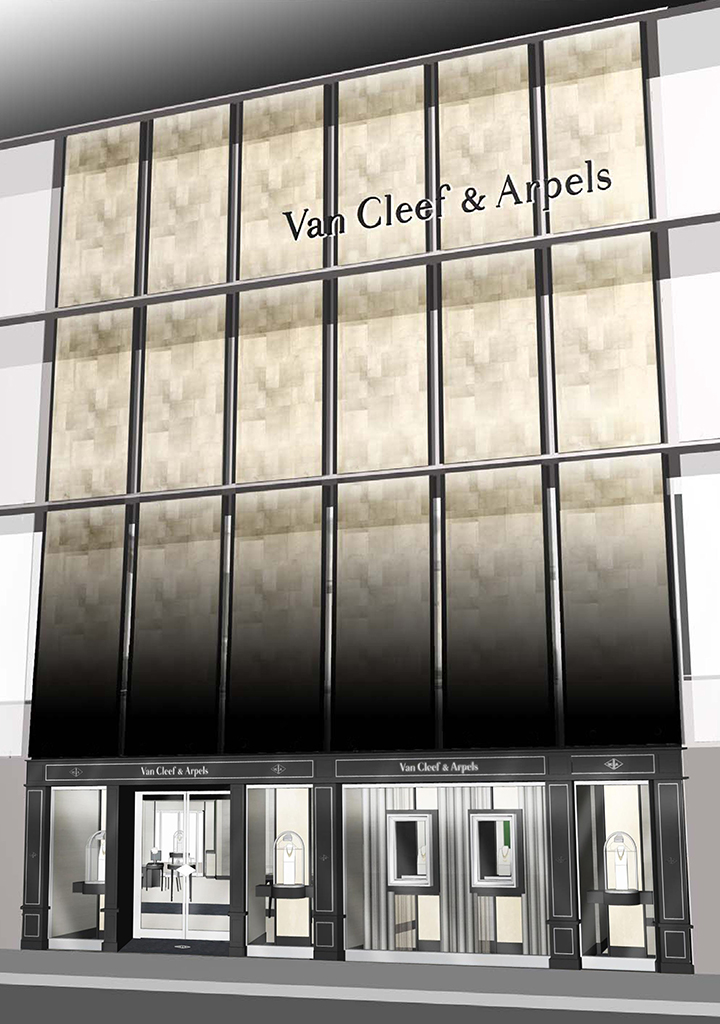
接着再看看SAINT LAURENT(地上3楼)。SAINT LAURENT奢华地使用黑与白的大理石为装饰,提出典型装饰派艺术的空间提案。展示柜及展示架等设备,使用镜面加工的素材,通过以极简为基调的空间,传达品牌的世界观。VAN CLEEF & ARPELS(地下1楼、地上2楼)由柔和的漆黑转变为金色的正面,在阳光照射下闪闪发亮,店内包括楼梯的扶手在内,壁面、电梯内部等地方,强力营造出装饰派艺术的设计,藉此呈现了与GINZA SIX的世界观相连结的雅致空间。
此外,在推出商品方面,DIOR推出了亚洲首座以品牌特有品味精心挑选的生活杂货区“Dior MAISON”。VAN CLEEF & ARPELS的整个2楼是日本国内首家婚礼沙龙。VALENTINO则将巴黎时装秀登场的特别服装陈列在店面,所有的品牌均为日本国内规模最大的店铺,并备有各种类别的商品。
CÉLINE (1F-2F) unveils a facade with a truly noren-inspired design, a statement on sense of locality and time made up of pieces of ceramic made from Japanese clay. Each and every piece of ceramic has been crafted by master potters in a long-cultivated and passed-down tradition of artisanal handicraft, creating the perfect introduction to the detailing of the interior, which incorporates mostly natural materials like clay and stones to impart an earthy warmth to the environment. Here, again, the arrangement of ceramic pieces gives rise to a contrast between light flowing in during the day, and the radiance given forth at night. This is a delicate, sensitive display that takes a different approach from purely decorative designs to create a singular expression of the CÉLINE universe. FENDI (B1-3F) has put up a facade inspired by the historic Palazzo della CiviltàItaliana in Rome, which currently houses the brand's headquarters. It is both a projection of Rome through the eyes of the brand's aesthetic, as well as a collaboration across cultures: the row of arches are geometric yet elegant, and embody a sentimental connection to Japan's tradition of noren.
Then we turn to SAINT LAURENT (1F-3F), which has created a space that evokes classic Art Deco design with lavish, decorative use of black and white marble. The showcases and display shelves are made using a material with a mirror finish and are positioned in a minimal space that allows the brand's vision to take center stage. At VAN CLEEF & ARPELS (B1-2F), the facade goes from soft jet black to gold and shimmers in the sunlight. The interiors feature Art Deco detailing, from the handrails on the stairs to the walls and even inside the elevator, bringing the impressively chic space in harmony with GINZA SIX's overall aesthetic.
One last note on product offerings—these six boutiques will be among each brand's largest retail locations in Japan, and each will carry the brand's full range of products. This includes, but is not limited to, the following: DIOR will present its Dior MAISON collection of select lifestyle items and homeware for the first time in Asia, while at VAN CLEEF & ARPELS, the entire second floor will be a dedicated bridal salon, a Japan first. VALENTINO will offer exclusive pieces from its Paris Runway Collection.
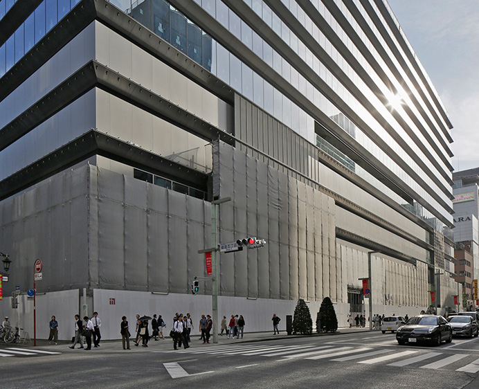
Text by Yuka Okada / Photograph by Toshiharu Kitajima


