
GINZA SIX EDITORS
时尚、珠宝&手表、生活方式、美容、食品…
精通各种类型的个性丰富的编辑们,在GINZA SIX上闲逛
记述走路发现的乐趣。
接触产品与空间、设计的前端 Products and Spaces on Design’s Cutting Edge
土田贵宏
GINZA SIX EDITORS Vol.4(Lifestyle)
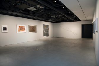
GINZA SIX的一种乐趣是,能够随处可见世界级设计师的新工作。馆内整体的空间构成也很宽松,有好几个店想带着画廊的心情走路。其中,我选择了一个一个想关注生活方式系的商店和空间设计的时装店。
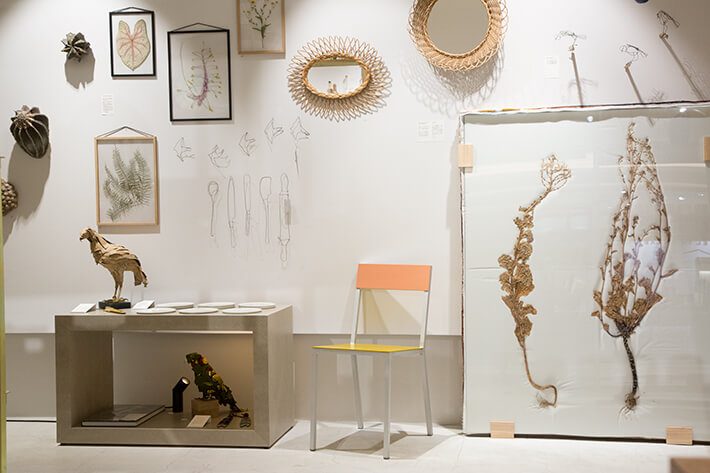
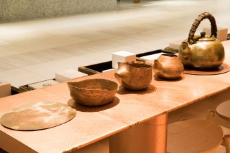
4楼的CIBONE CASE是从青山的CIBONE中旋转出来的店铺。这是一家在细致地利用审美眼光的同时,以银座的国际氛围为基础的店。这里经营的比利时新锐设计师Muller van Severen的椅子,其魅力在于具有工业感的迷你节奏和富有意外性的色彩。简直就像摩登艺术一样。
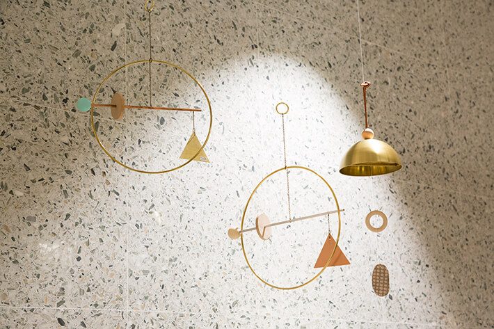
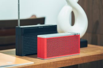
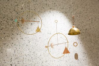
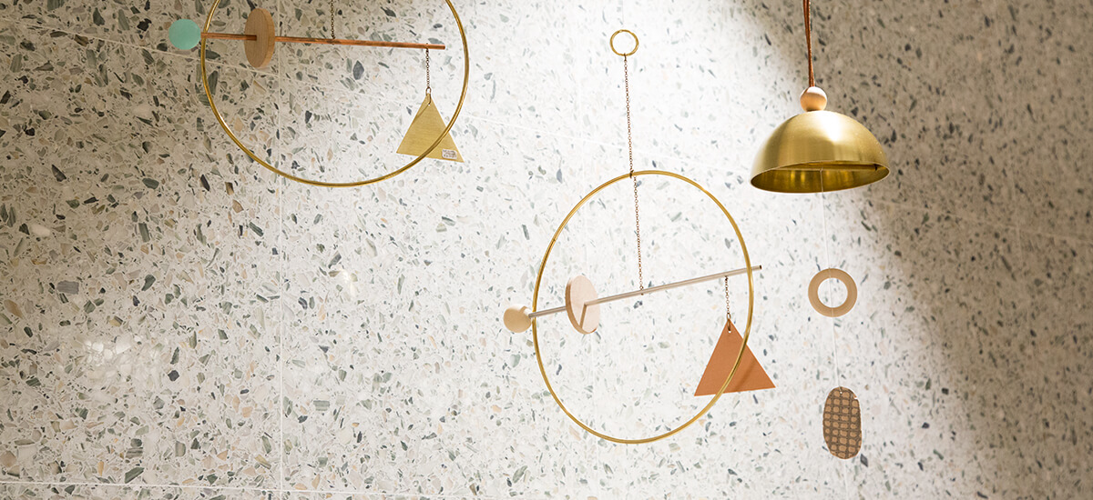
布鲁克林为据点的Ladies&Gentlemen Studio的“Aurachime”和“Playscape mobiles”。这是一部用自己的手组合身边的素材来构思设计的二人组的作品。这个产品摇晃就能听到朴素的声音,具有他们擅长的啤酒要素,80年代风的形状和颜色也是现在室内装饰的心情。
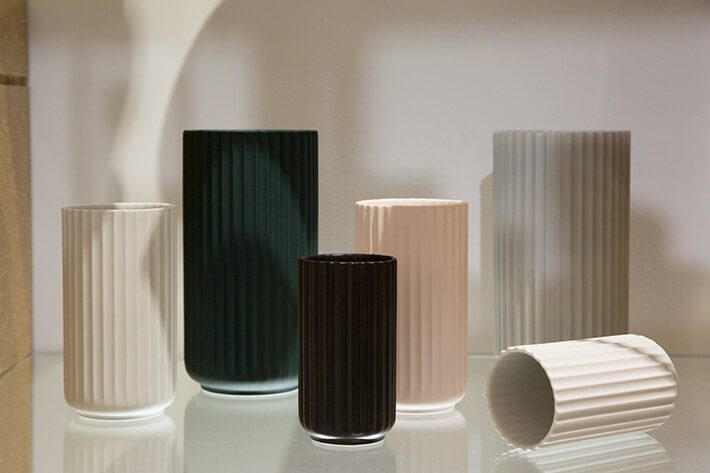
丹麦的传统品牌Lyngby Porcel娜的花底是1930年代开始生产的。颜色和尺寸的变化也非常绝妙,希望能排列几个一起使用。就这样,花也能画画。
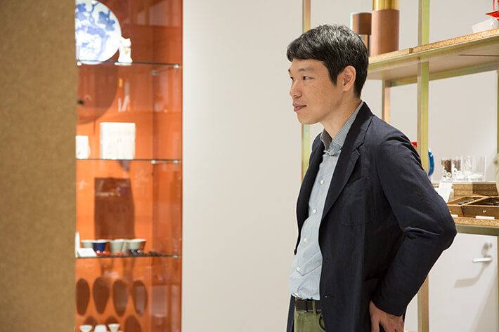
这里列举的3个项目中的2个,目前在日本的销售恐怕只有CIBONE。顺便说一下,在国外,经营这些东西的商店还只是一部分。从这个意义上来说,CIBONE在时代领先。而且CIBONE的独特之处在于,其中一分一分的时间轴上让人产生好感。想要看清未来的固定模式,这种平衡感非常漂亮。
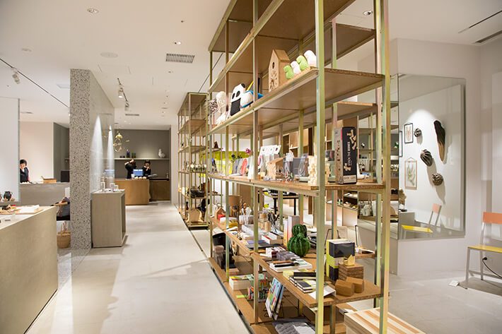
设计CIBONE CASE的室内装饰的是二俣公一。左右宽广独特形状的空间,设置有量感的墙壁和拉门状的架子,缓慢地隔开着。素材的选择巧妙,完成也很美,看着也不会腻。
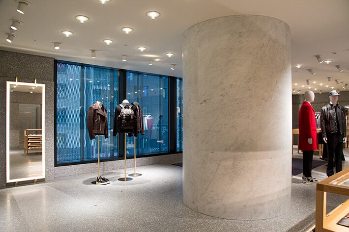
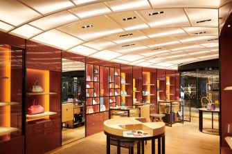
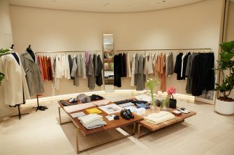
这里是从地下1楼到4楼的瓦伦蒂诺的时装店。GINZA SIX开张的时候,特别是被空间压倒的是这家店。现在,世界各国瓦伦蒂诺的室内装饰,由英国建筑师戴维·基帕菲特承担着很大的作用,其风格让人感受到与进行GINZA SIX设施整体外观设计的建筑师谷口吉生的搭配。时装店的墙壁和地板是均质的灰色地带(人工石)统一,彩色大理石、黄铜、橡树材等有效地使用。
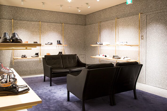
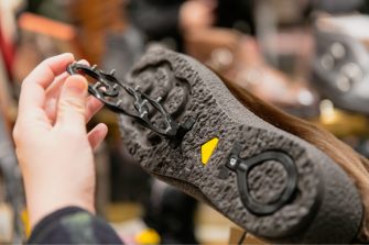
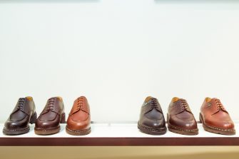
展示4楼男士鞋的空间。墙面的架子是整个店铺都使用的,上端挂在墙壁的台阶上的结构。不仅内置了照亮商品的LED,而且配合店内的布局左右移动,这让人吃惊。不愧是基帕菲特。
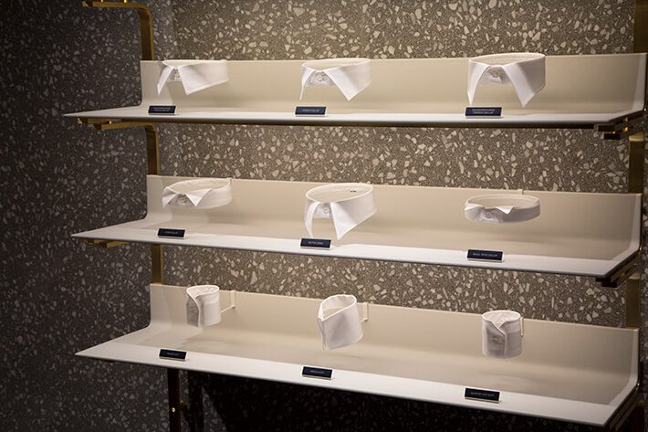
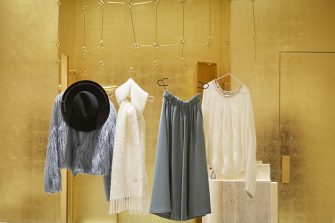
在4楼的女仆展区,摆放着衬衫颜色和卡夫斯样品的架子。店内几乎所有的架子都是用黄铜镜框和橡树材料做成的,这是用雪白的皮革包住架子板,端正形状的颜色像题材一样突出。
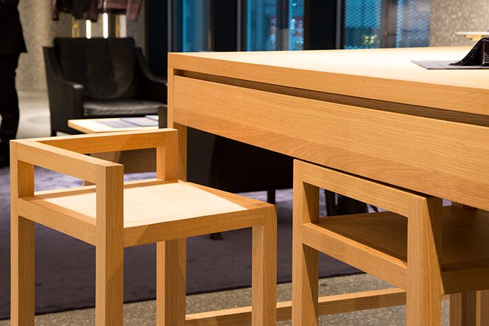
一系列的橡树家具也是由基帕菲特制作的。其特征是他特有的迷你形状,椅子正好放在桌子下面。在女仆特大专柜里,坐在这里交换西装和衬衫的订单。
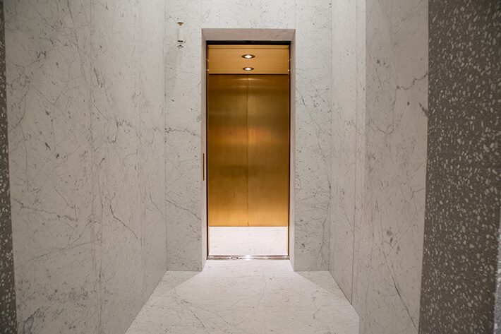
即使没有事也想体验的是连接店内楼层的电梯。除了大理石的地板以外,都是黄铜做成的,简直就像金的茶室一样。到达那里的方法也是用大理石做的。
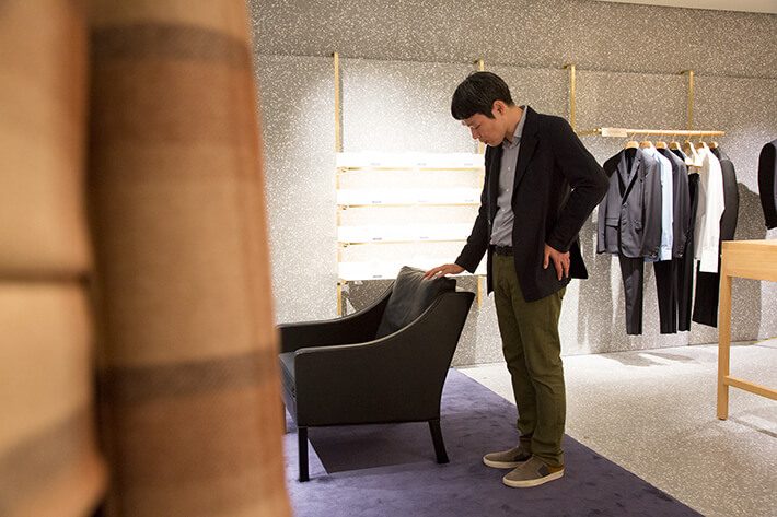
黑色皮革的休息室椅子是丹麦家具设计名手博埃·莫恩森于1963年发表的历史性作品。在每个角落都设有诡计的空间里,关于椅子,从选择能让人放松的东西的视点令人叹为观止。当然,优质和班级感是一贯的,完美协调。

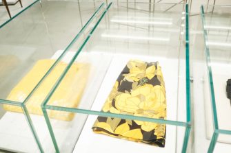
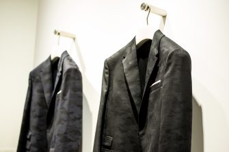
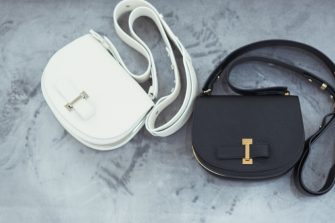
象征瓦伦蒂诺风格的道具之一,是卡姆斯特(伪装×明星图案)的包。从这个品牌的产品中感受到的是对时尚的压倒性的爱情和探究心,这也传达给了我(平时不以时尚为对象的)。比如说伪装在所有品牌中都被使用,但我觉得瓦伦蒂诺的花纹是最精致的独创性。
时装店的设计是这样每个季节产生的各种各样的道具的背景,同时也充满了建筑性的快感。虽然没能介绍完,但是大理石砌成的楼梯和灰色统一的纺织室也不容错过。“神寄宿在细节上”是近代建筑的黄金律,是能感受到其妙趣的绝佳景点。
Text : Takahiro Tsuchida Photos : Kaori Imakiire Edit : Yuka Okada
One of the joys of GINZA SIX is being able to experience the new work of world-class designers. The complex as a whole contains generous amounts of space, and visiting many of the stores feels just like visiting a gallery. Of these, I’ve selected one lifestyle store and one boutique with space designs I’d like to highlight.

Located on the fourth floor, Cibone Case is a Cibone spinoff, originally opened in Aoyama, Tokyo. While deftly incorporating the parent store’s refined aesthetic, the store here at GINZA SIX is rooted in Ginza’s international atmosphere. It offers chairs from Muller van Severen, an up-and-coming designer from Belgium, which are especially appealing for their industrial minimalism and unexpected color combinations. The overall impression is of encountering works of modern art.

The Aura chimes and Playscape mobiles from Brooklyn-based Ladies & Gentlemen Studio are the work of a two-person design team, who combine everyday materials by hand to create inspired designs. The chimes emit a soft ring with a rustic charm when moved by the breeze. Together with the team’s trademark mobiles, they infuse 80s-style forms and colors with the feel of today’s interiors.

This flower vase from the longstanding Danish brand Lyngby Porcelæn has been made since the 1930s. There’s a superb selection of colors and sizes. You can use a number of them together, and they offer a pictorial quality with or without flowers.

Two of the three items I’ve mentioned thus far are more than likely only available in Japan at Cibone at this time. And even overseas, you can find them at very few stores. In this sense, Cibone is ahead of the times. Another unique characteristic of the store is that each item is a type you become attached to over a period of time. In its commitment to uncovering the standards of tomorrow, the store exhibits a wonderful sense of balance.

Cibone Case’s interior was designed by Koichi Futatsumata. The uniquely shaped space offers ample space flowing laterally and is separated informally by voluminous walls and sliding shelves. The materials have been masterfully selected to create a beautiful finish that stays fresh in the eye.

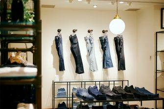
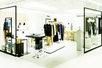
This is the interior of the VALENTINO boutique, which occupies space from the first underground floor up to the fourth floor. When GINZA SIX first opened, it was this store’s space that really impressed me. The UK architect David Chipperfield currently plays a major role in the interior design of Valentino stores around the world, and its style gives off a sense of kinship to that of Yoshio Taniguchi, the architect who designed the exterior of the overall GINZA SIX complex. The boutique’s walls and floors are unified with a homogenous gray terrazzo (artificial stone), while effective use is made of Carrara marble, brass, oak, and other materials.

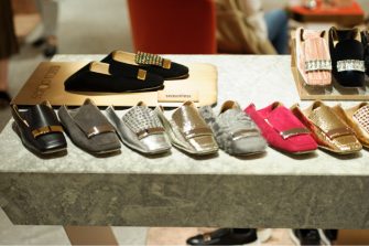
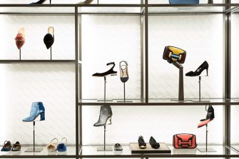
This space on the fourth floor displays the brand’s men’s shoes. The wall shelves are used throughout the store and are attached at the top to a ledge on the walls. The LEDs that illuminate the products are built into the shelves. I was surprised to learn that they can slide left and right, depending on the layout of the store displays, an example of Chipperfield’s distinctive ingenuity.

This shelf in the made-to-measure area on the fourth floor displays samples of shirt cuffs and collars. Almost all the shelves in the store are made of a brass frame and oak materials, but these shelf boards are wrapped in pure white leather, which accentuates the collars of the exquisite forms, as if they were objets d’art.

The oak furniture pieces are also Chipperfield originals. His distinctive minimalist forms are evident. Here, as you can see, the chairs fit perfectly just under the table. You can sit out here in the made-to-measure area to work out the details of your suit or shirt order.

Even if you don’t have a specific reason to, I recommend trying out the elevator that connects the floors inside the store. Other than the marble floor, everything is appointed in brass, like a golden tearoom. The approach is also made of marble.

This black leather lounge chair is a historic piece presented first in 1963 by renowned Danish furniture designer Børge Mogensen. Within this space of thoroughgoing stoic repose, the chair clearly conveys a perspective of items chosen for relaxation. And, of course, it radiates a consistent feel of quality and class that perfectly harmonizes with the rest of the interior.

One item that represents Valentino’s style especially well is the Camoustar bag, with its star and camouflage design. What I sense in the brand’s products is a true and deeply felt love of fashion and a sense of inquiry, which comes through even to a writer like me, who does not normally approach fashion. For example, camouflage is used by just about every brand, but Valentino’s pattern appears to me to be a highly sophisticated original.
The boutique’s design serves as a backdrop for various items that arrive each season while offering a wealth of architectural pleasures at the same time. Incidentally, while I wasn’t able to fully introduce them here, the all-marble stairs and unified gray fitting rooms are also not to be missed. “God is in the details” is the Golden Rule of modern architecture, and this is an ideal spot to experience the pleasure of its truth.
Author: Takahiro Tsuchida Photographer: Kaori Imakiire Editor: Yuka Okada
土田贵宏
作家、设计记者。1970年出生于北海道。经过公司职员,2001年开始作为自由职业者活动。以家具等产品为中心的设计和周边文化向专业杂志等投稿。在学校里教,或者做表演表演的时候。


